

Getting Stuck Into Lawn Signs
I took a picture of (almost) every political lawn sign in Davenport.

If this is your first time here, I'd like to assure you that the blog name is a reference to an oxymoronic soccer position and not some edgy political position.
This blog typically covers ideas in sports analytics, but over the last few months I have been on a parental leave that has included long walks around the Davenport federal electoral district. And in the lead up to the 2025 Canadian Federal Election, I observed three things that didn't quite add up and led me down a bit of a rabbit hole.
In the previous 2021 Canadian Federal Election, Davenport was decided by just 76 votes with a turnout of 47,736, with the NDP candidate Alejandra Bravo narrowly losing to Liberal incumbent Julie Dzerowicz.1
There seemed to be an incredible number of lawn signs on display for the NDP candidate Sandra Sousa.2
The Canada338 election forecasting website offered a greater-than-99% chance of the Liberal incumbent retaining her seat in Davenport.
With my anecdotal evidence of an increased NDP enthusiasm in a district that was previously decided by a razor thin margin, it felt pretty strange that the leading forecast website suggested such a landslide in favour of the Liberal candidate.
My hypothesis was that the forecasts were grafting too much of the country-wide shift toward the Liberals in districts that had strong NDP bases of support.
And this might be a good time to remind the readers that I am not a political scientist, just a computer scientist with an unreasonable level of confidence3.
There are two additional dynamics that led me to formulate this hypothesis:
It is difficult to perform riding-level polling in Canada because, unlike in the United States, area codes don't reliably correspond to electoral districts and you can't randomly call numbers in an area code and gather a representative sample.
The multi-party system, coupled with first-past-the-post voting, causes situations where informed voters can rationally be motivated to vote strategically. This effect seems really difficult to reliably forecast.
Obviously, my hypothesis was eventually proven very wrong, but I set out to capture some additional data that I thought might help illuminate the political dynamics in the riding and can perhaps be useful when forecasting future elections.
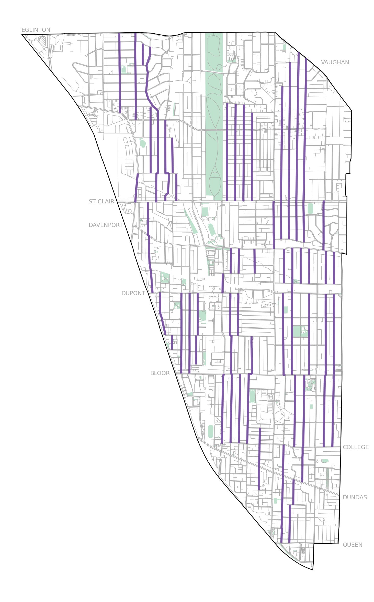
Over the week leading up to the election, my son and I strolled 65 kilometers up-and-down the Davenport federal electoral district taking pictures of every single lawn sign that we passed. We also visited 8 parks – he loves the swing.4
After realizing that there wasn’t enough time to walk every single street in the riding5, we decided to focus on all of the largely residential North-South streets6, hoping that there isn't much political bias between the populations that live on North-South versus East-West streets.
A 2024 budget document from the City of Toronto estimated that there were about 5,600 km of roads in the entire city. Assuming the density of roads per square km is roughly consistent across the city, Davenport should have about 107 kms of roads.
This back-of-napkin math suggests that I covered somewhere around 60 percent of all the roads in Davenport. Since I largely walked North-South, and given the unusual shape of the electoral district, that sounds about right to me.
Using these rough ratios, I extrapolated my observed signs to estimate the number of votes that each candidate earned per sign.7
Any statistical test that you throw at these numbers will easily and confidently assure you that the sample that I observed was a very poor representation of the actual voting population. I anticipated that there was going to be an enthusiasm gap between each of these parties, but not something so extreme!
There are some unlikely yet realistic explanations for this enthusiasm gap other than political peculiarities. Maybe the Liberal party ran out of signs? Perhaps the Conservative party decided that it wasn't worth printing many at all (like the Green Party)? Those constraints would certainly skew the the observation numbers.
Each sign is internally traceable by the distributing political party because it is their responsibility to ensure that political signs are removed promptly following election day. I'd be curious how closely my numbers match up with their actuals.8
When you take a picture on a modern mobile device, the GPS location is logged alongside other metadata at the time of capture. After categorizing each of the signs9, here's the distribution of Davenport lawn signs!10
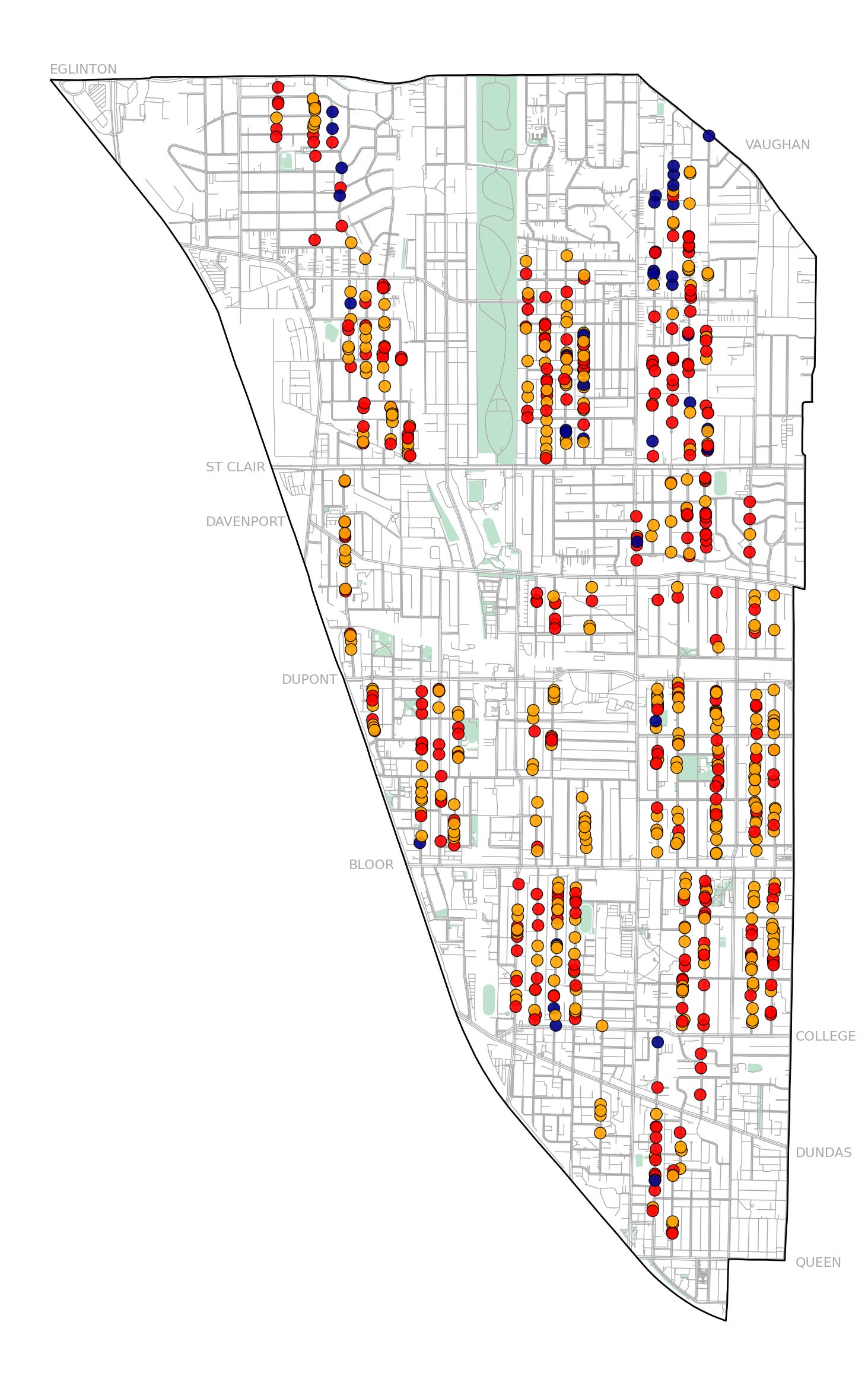
The spatial data paints a very clear picture – Davenport is far from a political monolith. There are pockets where political preference skews in different directions.
Some observations:
Estimates very Rough.
We’re a month past and Elections Canada still hasn’t released poll-by-poll data for the election and I haven’t been able to find a updated boundaries for the polling divisions since the redistricting. With this data, you could repeat this riding-level analysis at a polling-level and construct more precise estimates. Would anyone be interested in that?
Davenport is Big.
There are quite a few regions of the riding that I didn’t quite get to, particularly in the more hilly northern areas and western industrialized sectors. This probably biased the numbers a little bit. There were entire polling divisions that I didn’t step foot in.
Below is a map of the North-South streets that I covered, highlighted in purple.
Putting a sign on your lawn is a social act.
Just north of Geary, I walked along two practically identical streets. One had a half dozen signs proudly stuck in the grass. On the other, absolutely none. We’re working with low sample sizes here, but I can’t imagine one street is statistically less inclined to be politically active. The houses are the same age. The sidewalks the same width. The yards no more or less sign-friendly.
What this really illustrates is how public displays of political support — like putting up a lawn sign — are not just expressions of individual belief, but also social acts influenced by what others around us are doing. It doesn’t take much imagination to picture the first sign going and slowly emboldening the neighbours. Maybe someone sees it while getting the mail. Maybe they bring it up in a chat on the sidewalk. Whatever the path, there's a contagious quality to it.
This sort of peer signalling is well-documented in social science: humans take cues from their environment to decide what’s acceptable or encouraged. Lawn signs aren’t just about supporting a candidate — they’re about being seen supporting a candidate. And that visibility becomes permission for others to do the same.
On the other street, perhaps no one wanted to be first. The absence of signs isn’t necessarily apathy — it may just be inertia. Without a visible cue, the feedback loop never gets started.
It’s a small example, but it hints at something powerful: much of what we think of as political engagement happens at the intersection of personal conviction and public perception. All it might take to tip a street from silent to orange is one neighbour and a garden stake.
Redistricted Areas Seemed Different.
Davenport went through a redistricting process in 2023, adding a few square kilometers in both the northeast and the northwest corners of the riding. And a small chunk in the south-east.
These areas had demonstrably fewer signs per kilometer covered, and they even had a few signs on display for candidates in their old riding.
The new voters in the added regions also skewed against the NDP. As a part of the redistricting process, Elections Canada created a report that “summarizes the transposition of the results of the 44th general election in 2021 to the new boundaries established by the 2023 decennial Federal Electoral District (FED) boundary readjustment process.”
This report erased that narrow 76 vote margin and created a wider gap 2,144 votes. And looking at the map above, you can see why. The signs in the northern extremities of the district skew more conservative.
Wear Sunscreen!
And reapply regularly. Even when it’s not too sunny out.
What I’d do Next Time.
With the exception of the more northern reaches of the district, signs were probably too dense to reliably catch them all unless you were walking. In theory you could do this in a car or on bike, but you would be stopping too regularly and your visibility would be too constrained to be confident that you’re exhaustive.
On one-way streets, it’s important to walk in the same direction as vehicular traffic. Signs are placed relatively strategically to make them more noticeable for drivers. When I was walking against the flow, I frequently had to back-track.
Because one-way streets are often interleaved in an alternating fashion, you can stay in the correct direction of flow with a little strategic mapping beforehand.
And this doesn’t need to be a one-dad-and-toddler exercise. If you can reliably de-dupe the data, I think this could be easily parallelized across a dozen canvassers in sneakers to capture the entire riding in a day.
What’s Next?
This exercise was never meant to predict the outcome of the 2025 election in Davenport — and it didn’t. But that doesn’t mean it wasn’t worthwhile. What I’ve collected is a snapshot: a record of visible political enthusiasm, gathered systematically and (somewhat obsessively) on foot. It’s not representative, and it’s certainly not predictive. But it is something to compare against in the future.
If I repeat this walk in a future election, these numbers — enthusiasm rates, spatial clustering, sign density — become a baseline. A kind of hyper-local prior. And while lawn signs alone won’t forecast an outcome, they might illuminate shifts in confidence, messaging, or engagement that broader models miss.
In districts like Davenport, where multi-party dynamics and strategic voting have genuine potential to influence outcomes, even small sources of local insight can matter. I suspect that uncertainty about how close a race truly is often leads voters to adopt a more cautious approach.
Having better tools for observing and interpreting neighbourhood-level political dynamics won’t eliminate that uncertainty. But it might shrink it and that’s progress.
Sports Overlap.
A quick epilogue for the sports nerds that somehow made it this far –
From my very limited impression, political campaigns have certain similarities to professional sport management. Political strategists, like team operations staff, are regularly making tactical decisions among the fog of incomplete information while under some sort of time pressure. It is difficult to cultivate genuine competitive advantage in these wicked learning environments11.
A useful framework that I use to think about competitive advantage in these environments is to categorize it into three streams: informational, analytical, and behavioural12.
The data in this post represents a potential informational advantage. Since lawns signs are only on display for a limited time, this information is ephemeral unless systematically captured. And in my experience, informational advantages are both the rarest and most valuable in the applied theatre.
It's also worth noting that the most recent Ontario General Election was held in February 2025 (i.e 3 months ago!) and the NDP Candidate Marit Stiles defeated the Liberal Candidate by a whopping 37 percentage points with a slightly reduced turnout of 39k voters.
And Alejandra Bravo went on to win the 2022 Toronto Municipal Election for Davenport Ward 9 City Councillor with 70 percent of the vote!
We don’t have much of a lawn, but we did have a sign.
I am an American who is relatively new to the Canadian political system. It's probably not a coincidence that some of this increased civic interest came during a period where I was studying for my Canadian citizenship test. I passed!
Walking Log:
Tuesday, April 22nd – 14.3km
Wednesday, April 23rd – 12.5km
Thursday, April 24th – 13km
Monday, April 28th (Election Day) – 25km (!)
Riding is an informal Canadian word for Electoral District.
Of course, this entirely excludes populations that live in some of the higher-density condos in the district. While this is a minority of the population, I don’t think it’s a safe assumption that their political preferences are proportional to the rest of the riding. You can see this clearly in some of the historical poll-by-poll data.
Estimated Signs = Observed Signs / 0.60
In Toronto, election signs must be removed within 72 hours after voting day, as required by Toronto Municipal Code Chapter 693. If signs are not taken down in time, the City may remove them and charge the candidate or party $25 per sign, deducted from their election sign deposit. This enforcement mechanism, enabled by the Municipal Elections Act, 1996, gives parties a strong incentive to track their signs internally.
As a small side-side-project, I trained a tiny image classifier on top of MobileNetV2 that got about 95% accuracy on out-of-sample images, but I ended up just labelling everything by hand since it only took an hour. It was only 743 images.
These plots are constructed with Open Street Map data, utilizing Python tools like osmx, shapely, and geopandas. Much of this code was written at the 1RG Side Project Social. I used the Arc Timline iPhone app to record which streets I walked and arc-to-sqlite to extract the data.
The term wicked learning environment was introduced by cognitive psychologist Robin Hogarth to describe settings where feedback is misleading, delayed, or incomplete—making it difficult to learn accurate patterns or develop reliable intuition. This contrasts with kind learning environments, where feedback is immediate and reliable, like in chess or golf.
This framework was introduced by Davenport, Harris, and Morison in Analytics at Work: Smarter Decisions, Better Results (Harvard Business Press, 2010), where they outline how organizations build competitive advantage through data-informed behaviour, superior information access, and advanced analytical capabilities.